Wfacts Project
WFacts Project, a student-led NPO, had a great mission: "making learning more fun for students". But its visual identity, or lack thereof, was holding it back. So a visual refresh was needed to foster a better connection with its audience.
WFacts Project, a student-led NPO, had a great mission: "making learning more fun for students". But its visual identity, or lack thereof, was holding it back. So a visual refresh was needed to foster a better connection with its audience.
Organization
Wfacts Project
Industry
Education
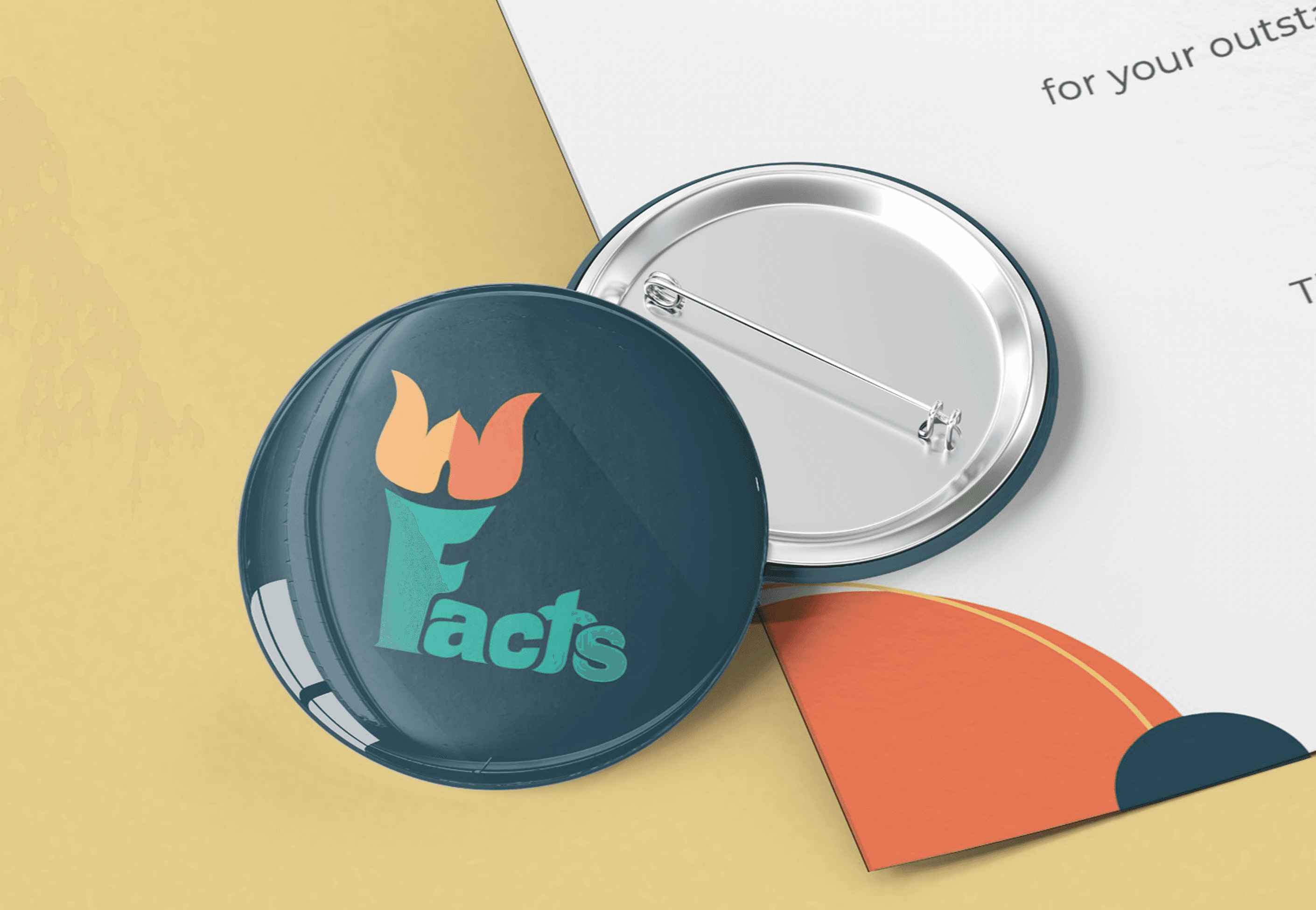
Deliverables
Logo, Brand Assets, Social Media Graphics, Certificate Design, Merchandize


DISCOVER
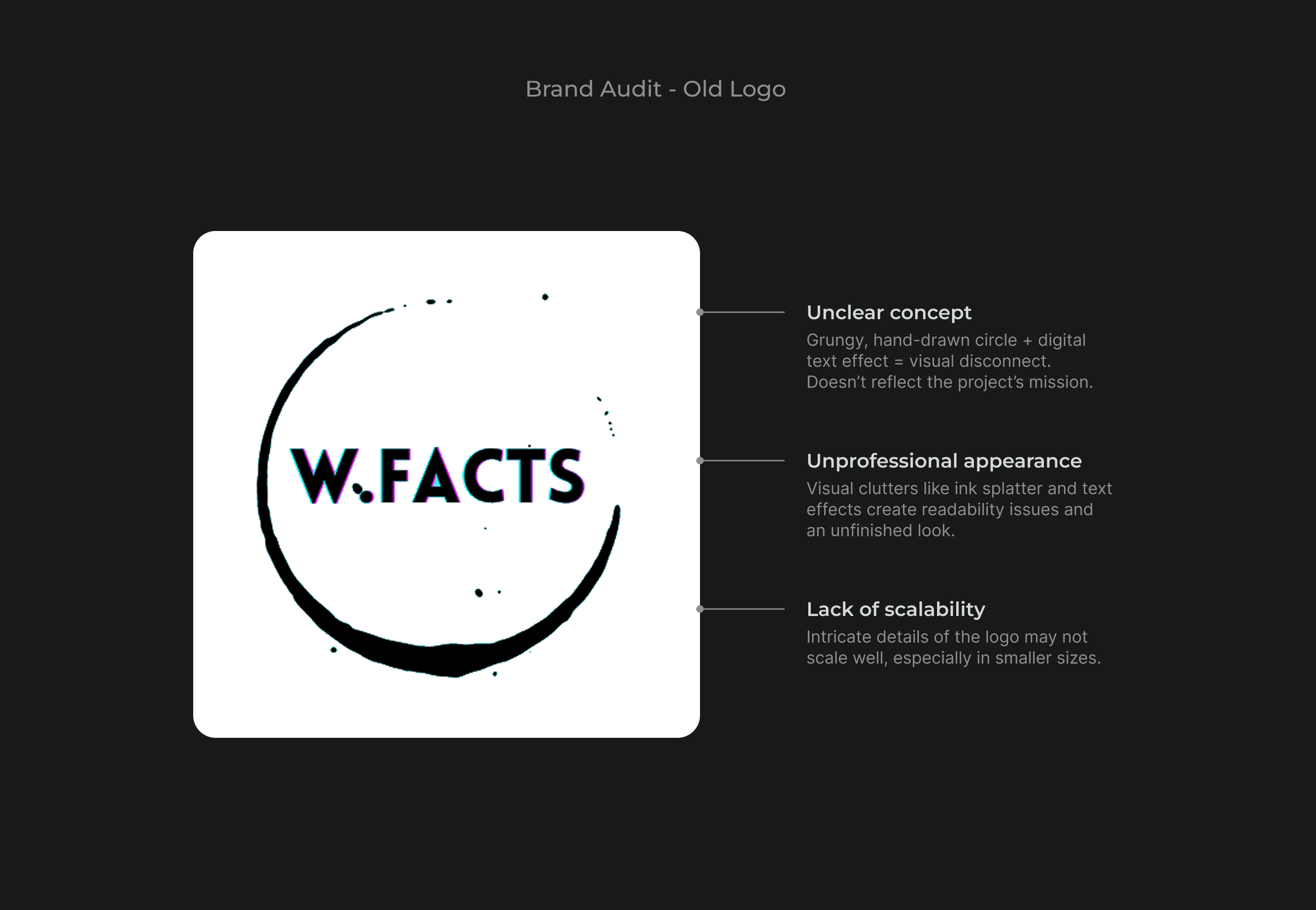
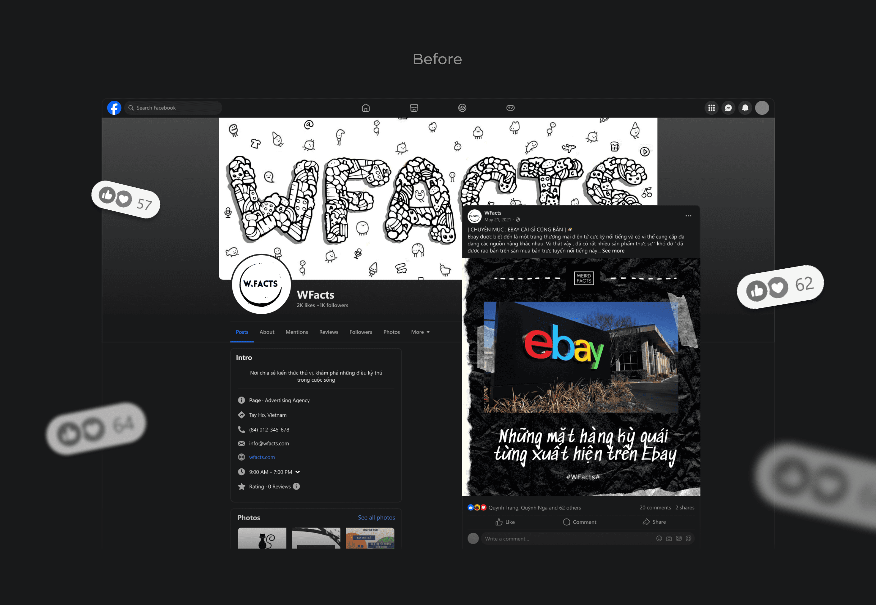
Missing identity = Missing connection
By analyzing the existing social media content, I found out that WFacts lacked a clear visual direction. Additionally, the logo was outdated with unnecessary effects that made it hard to read and scale, which explains why it wasn't present in any photos except for the profile picture.
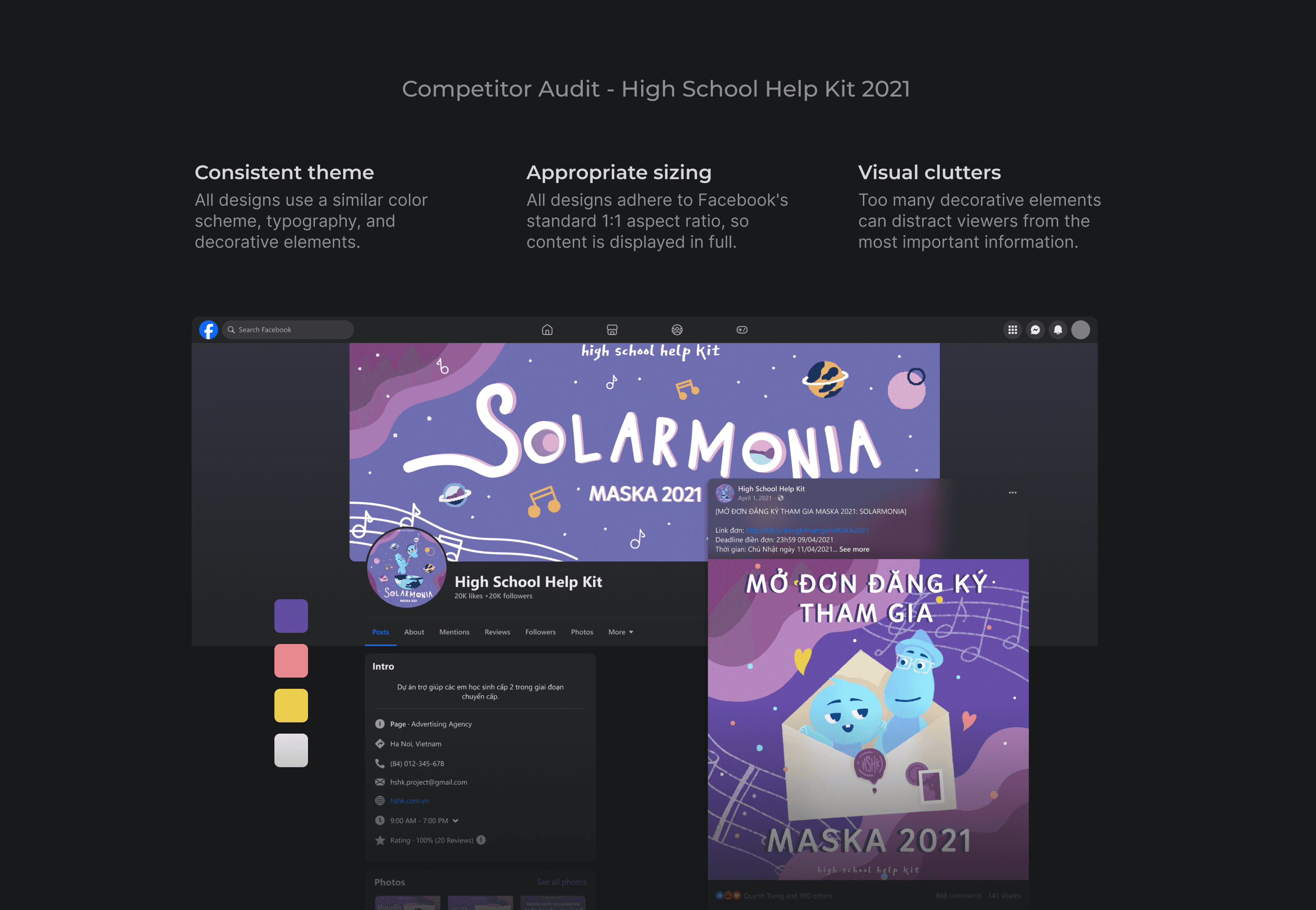
I also looked at how other educational NGOs present themselves visually on social media. This helped me identify effective strategies and areas for improvement, in order to inform my design decisions for WFacts.
From here, I defined the scope of the rebranding initiative, which included:
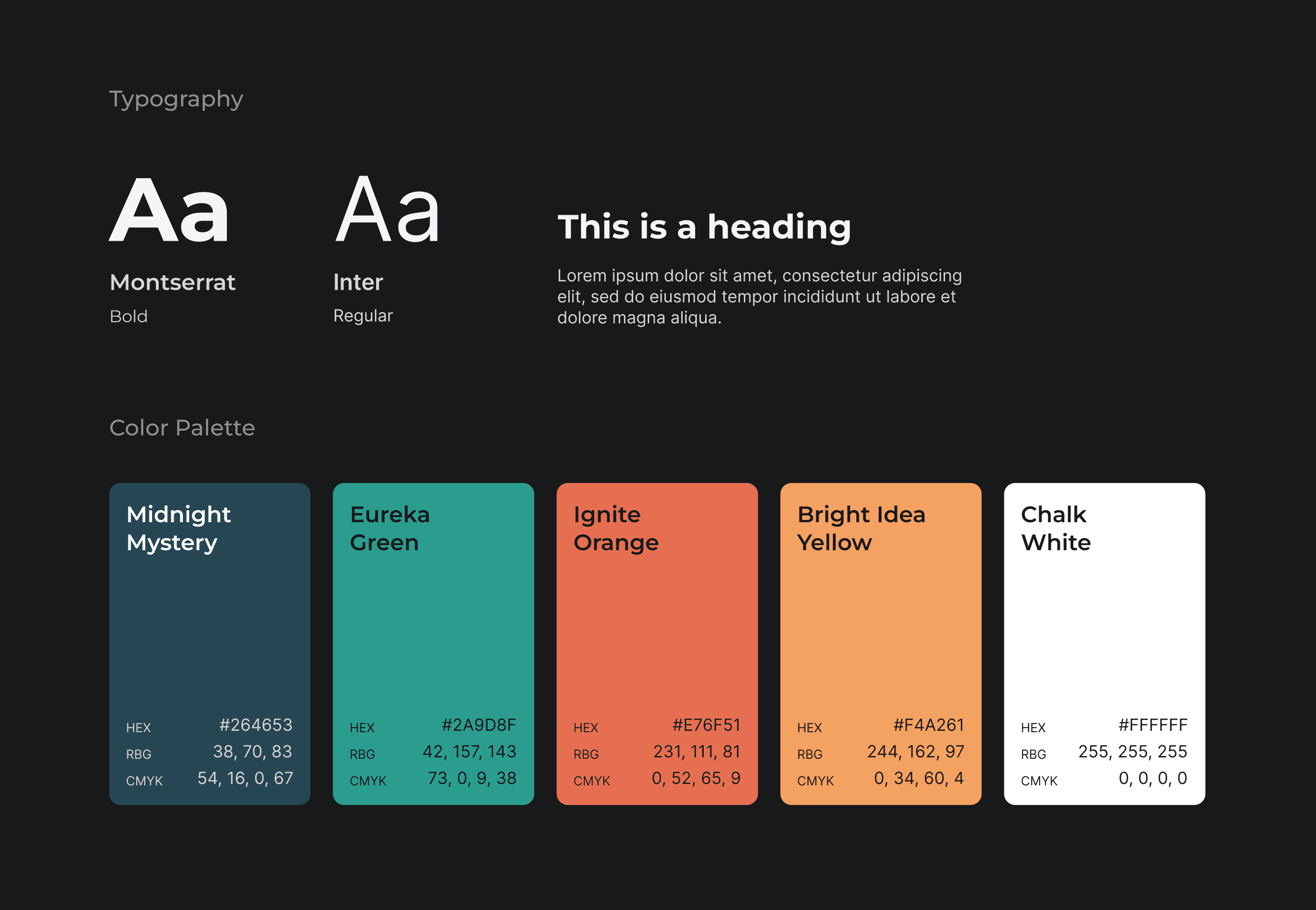
A new logo that conveys the brand story
A cohesive color palette

DEVELOP
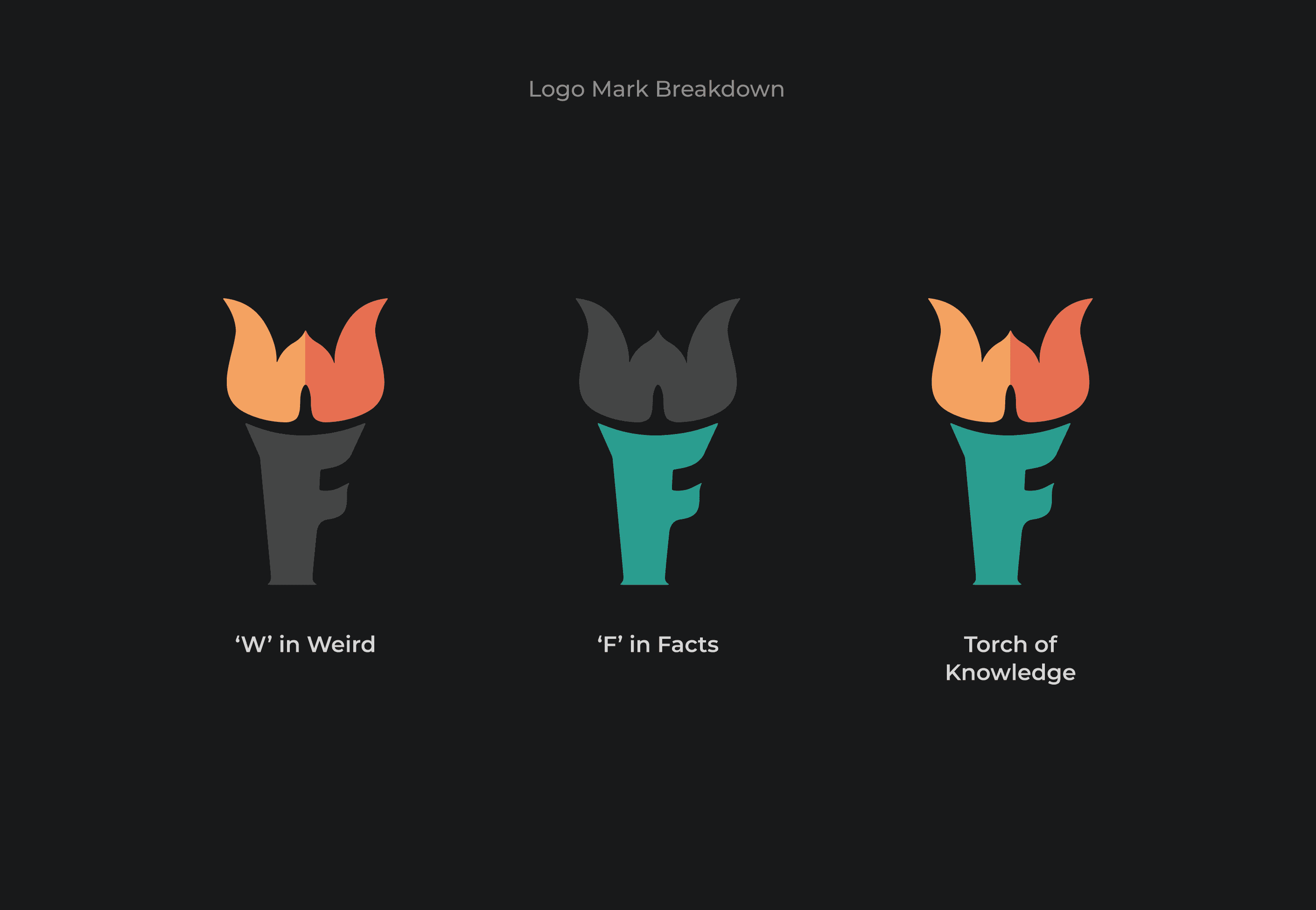
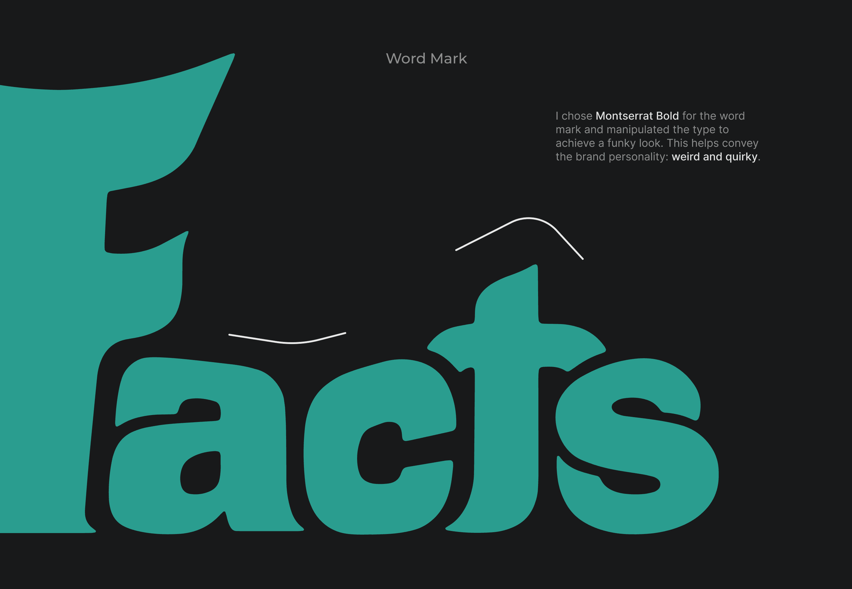
Designing a logo with no experience
At the time, I knew nothing about logo design. I was barely even proficient in Adobe Illustrator. All I had was an idea, and I needed to bring it to life, no matter what.
So I was learning and doing the job at the same time. With my dining table full of sketching paper, Google search full of how-to's, and an Illustrator file full of unnamed layers, I made it work. There were a few rounds of revisions here and there, but eventually, everyone in the team loved the end result.
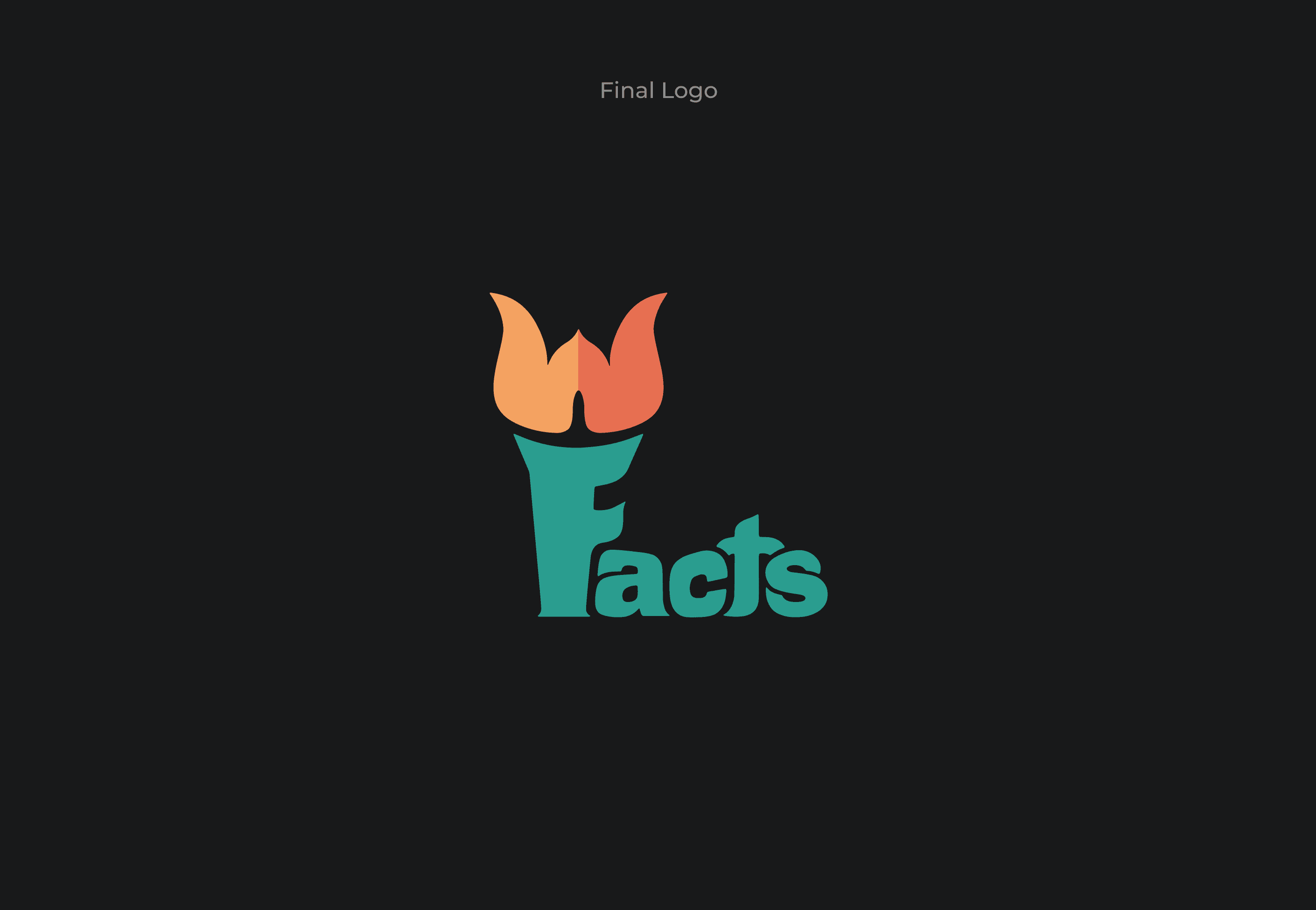
DELIVER
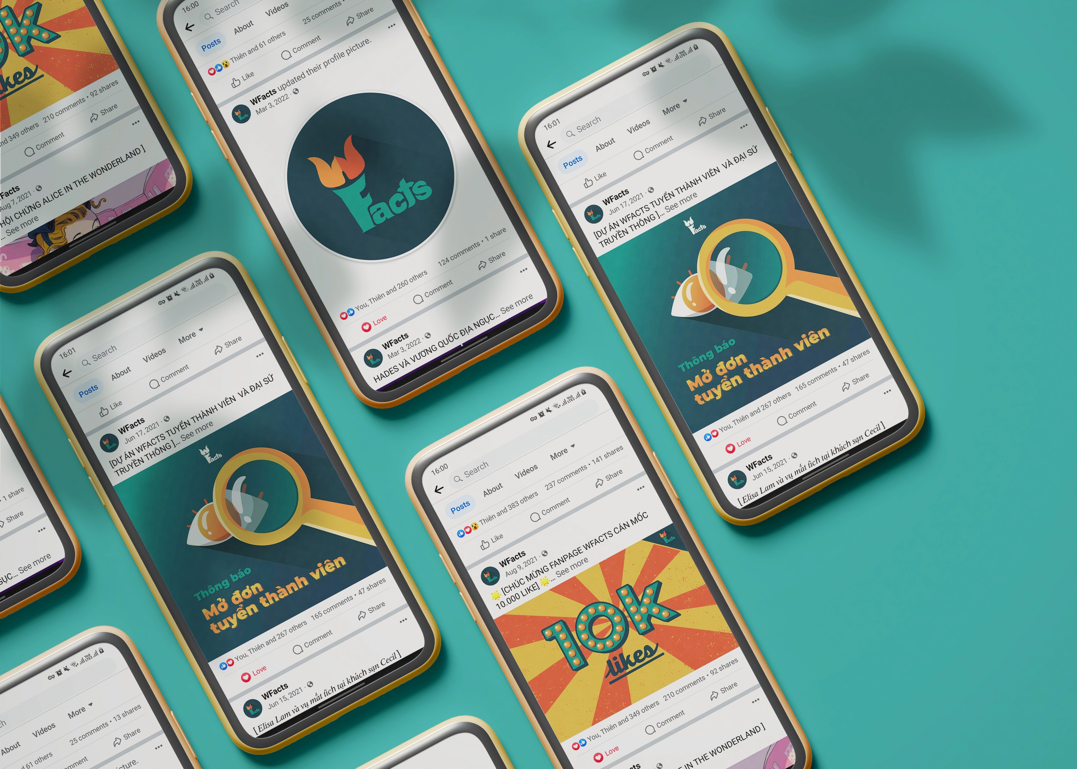
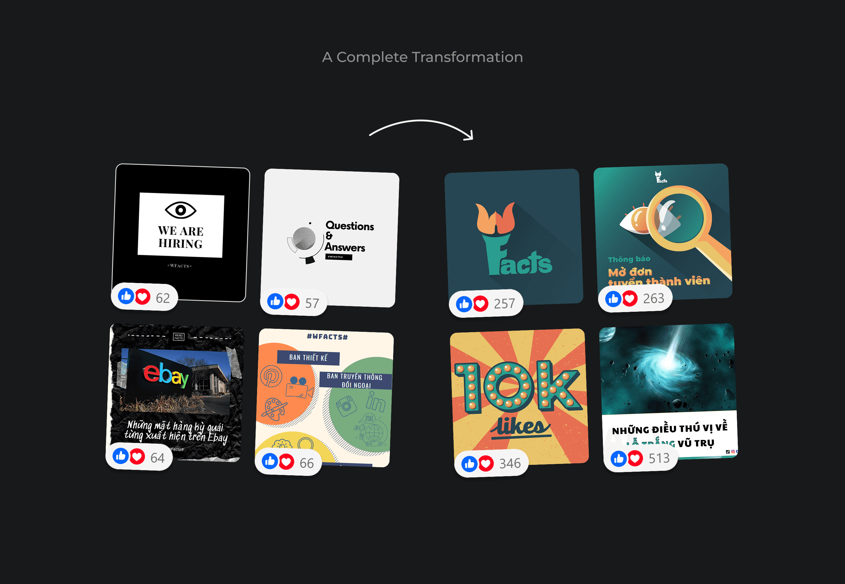
A complete makeover
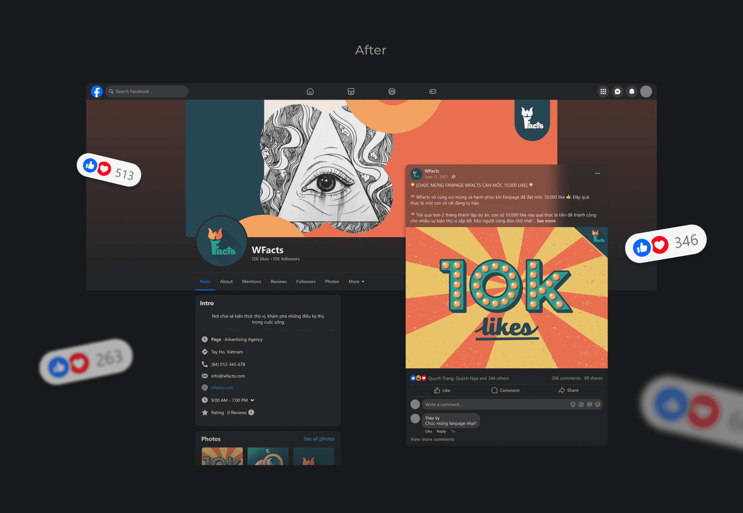

KEY RESULTS
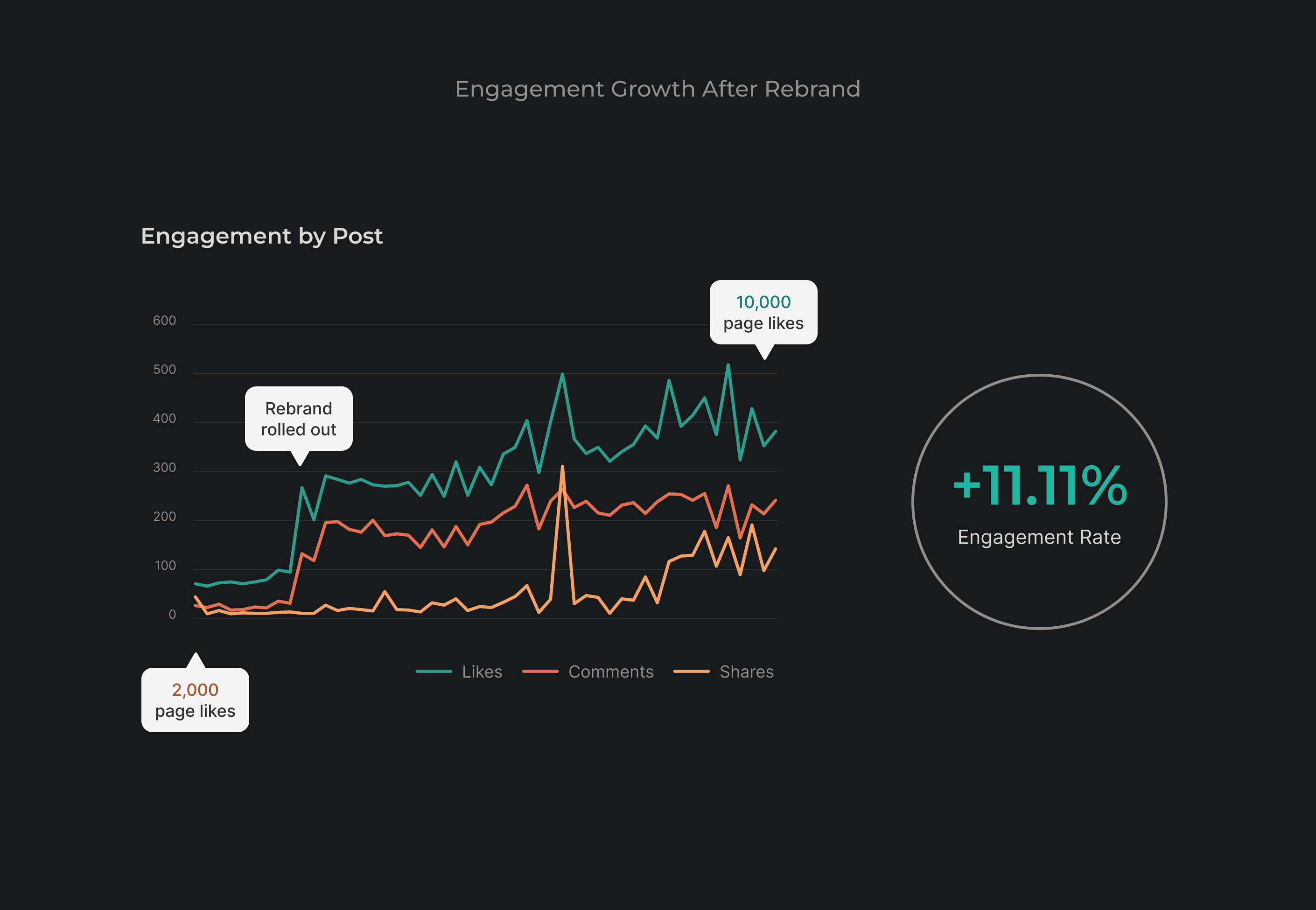
Engagement increased by 11.11%
To my own surprise, the rebrand not only transformed WFacts' social media presence but also drove significant engagement growth.
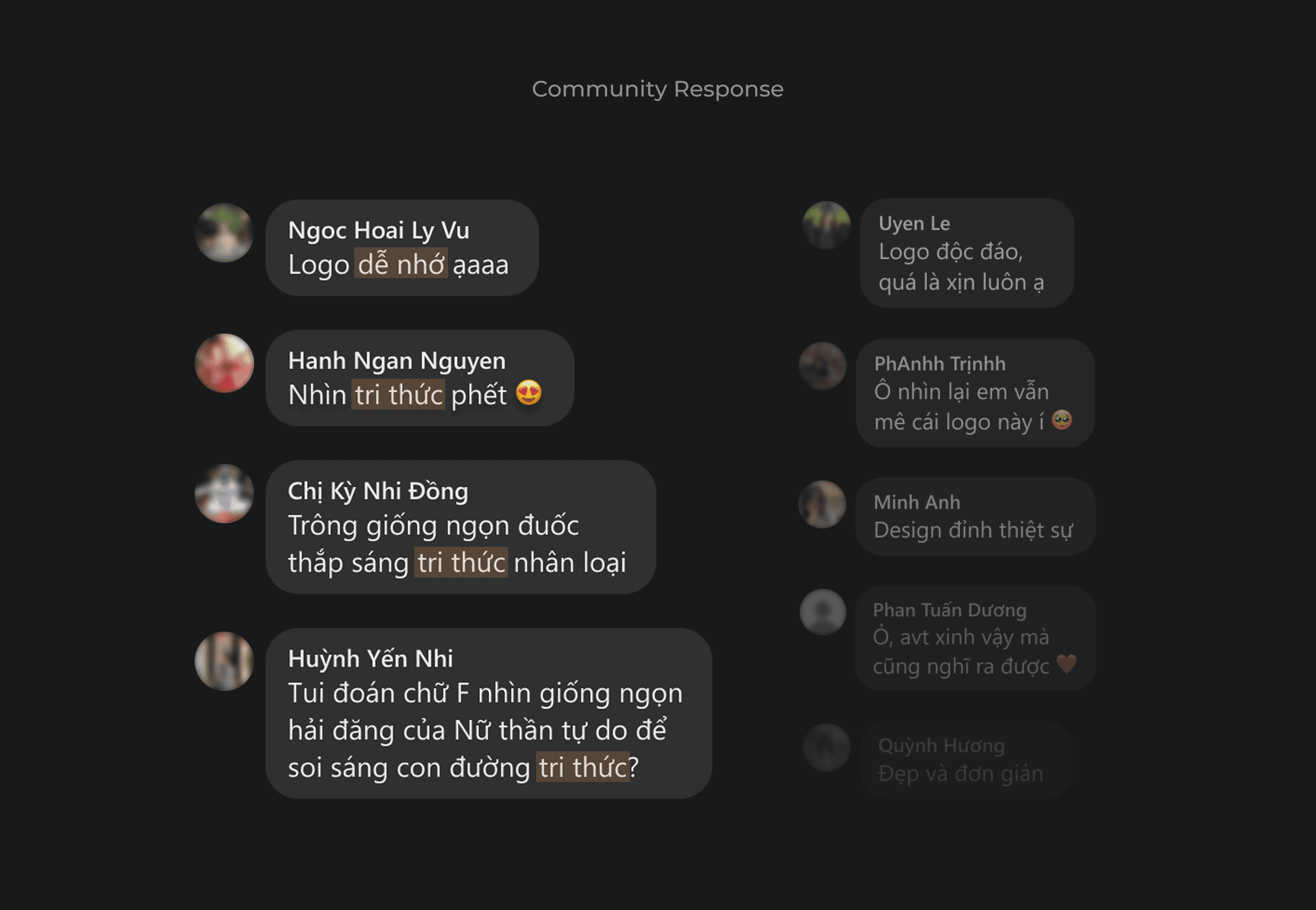
When the new visual identity was launched, we received hundreds of positive comments from our community. Many said the logo was memorable (”dễ nhớ”), and immediately associated it with knowledge (”tri thức”).
In less than 2 months, our Facebook page reached 10,000 likes, with an engagement rate of 5% (compared to 4.5% at the very beginning).
KEY LEARNINGS
3-year reflection
Even though this rebrand was successful, looking back, I see plenty of ways I could improve. In future projects, I'd like to:
For logo design: Use a more geometric approach for a more balanced and polished look; and exaggerate negative spaces to make the logo legible from a distance.
For collaboration with designers: Establish clear brand guidelines from the start - this is crucial for ensuring everyone applies the visual identity correctly and consistently.
For collaboration with copywriters: Continue using social media post templates, as they're a great way to streamline content creation and maintain a consistent look.
DISCOVER
Missing identity = Missing connection
By analyzing the existing social media content, I found out that WFacts lacked a clear visual direction. Additionally, the logo was outdated with unnecessary effects that made it hard to read and scale, which explains why it wasn't present in any photos except for the profile picture.
I also looked at how other educational NGOs present themselves visually on social media. This helped me identify effective strategies and areas for improvement, in order to inform my design decisions for WFacts.
From here, I defined the scope of the rebranding initiative, which included:
A new logo that conveys the brand story
A cohesive color palette
DEVELOP
Designing a logo with no experience
At the time, I knew nothing about logo design. I was barely even proficient in Adobe Illustrator. All I had was an idea, and I needed to bring it to life, no matter what.
So I was learning and doing the job at the same time. With my dining table full of sketching paper, Google search full of how-to's, and an Illustrator file full of unnamed layers, I made it work. There were a few rounds of revisions here and there, but eventually, everyone in the team loved the end result.
DELIVER
A complete makeover
KEY RESULTS
Engagement increased by 11.11%
To my own surprise, the rebrand not only transformed WFacts' social media presence but also drove significant engagement growth.
When the new visual identity was launched, we received hundreds of positive comments from our community. Many said the logo was memorable (”dễ nhớ”), and immediately associated it with knowledge (”tri thức”).
In less than 2 months, our Facebook page reached 10,000 likes, with an engagement rate of 5% (compared to 4.5% at the very beginning).
KEY LEARNINGS
3-year reflection
Even though this rebrand was successful, looking back, I see plenty of ways I could improve. In future projects, I'd like to:
For logo design: Use a more geometric approach for a more balanced and polished look; and exaggerate negative spaces to make the logo legible from a distance.
For collaboration with designers: Establish clear brand guidelines from the start - this is crucial for ensuring everyone applies the visual identity correctly and consistently.
For collaboration with copywriters: Continue using social media post templates, as they're a great way to streamline content creation and maintain a consistent look.